
Issue
We recognize that Crash Magic can be initially daunting to some new users. But it can be a very powerful tool for analysis, so we want our users to become masters! As always, if you need any help, or would like us to create a custom report for you, please let us know. These instructions will help get you started with the basics.
Explanation
This article will describe the basics for:
- Changing your password
- All data / By date study
- High location list
- Creating a diagram
- ClickOn
- Filters
- Charts
- Tabular listing reports
Solution
Changing your password
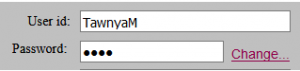
You can change your password during the login process. Once you’ve typed in your login and temporary password given to you, click on the “Change…” link to the right. This will allow you to type in a new password to set.
If you ever forget your password, it can be reset by the group Administrator.
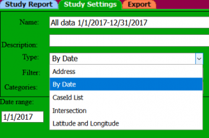
To do a basic study, click on the New Study button. Then choose the green Study Settings tab at the top. Then choose the type of study you wish. The first time I look at a database, I usually choose the All data study type or the By date type. Then give it a date range, 1/1/2017 and 12/31/2017 (or whatever date range is available).
In order to “refresh” click back on the left side (tree) on the untitled option. This will refresh and do the study. You may also choose to click on the blue arrow , and it will update the study to reflect the number of crashes in that study.
Now you have a study that you can run reports on for the date range. Also keep in mind for future studies, that when you run a filter with this date range study, it will give you information about where all the high crash locations are for certain criteria, like where all the bicycle crashes or pedestrian crashes are with the respective filters set.
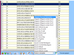
Using the previous date range study, click on the Location list button at the top. This will do an intersection study for the date range, listing the top crash locations. This report can also be modified to show other fields in the database, or break out the collision type totals for the intersection. Contact us for help with this.
Once this report has finished running, you can create a diagram, report or chart from one of the intersections listed. In order to do a diagram, click on the intersection you want, which will highlight. Then below from the list box, click on the down arrow where it says to “select a template”, then pic the “diagram: four-way intersection” option.
Then click on the plus button next to it.
This will create a diagram and a new study from the intersection you chose.
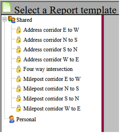
Once you have created a study, you can create a diagram by clicking on that button. You will be asked to choose a diagram template, usually the “Four way Intersection” will give you a good place to start. Then click the “ok” button, and the diagram will be displayed.
If you hover your mouse over one of the crash graphics (it will highlight), then you can click on the graphic and a report will be displayed to the right showing the data for the crash.
This field list can be changed by clicking on the field list button at the top of the report.
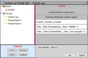
Choose the “ClickOn” at the top left side, and hit the “Duplicate” button. This will make a copy of the Clickon report to your personal account. (You could also click on the “New Field List” button to start a new list from scratch. Then with you mouse, click on the “Clickon copy”, to activate it, then the “Edit” button. You will be presented with a list of all the fields in the database to choose from for the report. Highlight the fields you want by clicking on them, you can also hold down the control key or shift key as appropriate for choosing fields. Then click on the right arrow button to add them to the list to the right. Once you’re finished, click the “Save and Return” button on the lower right side.
For this example, click back on the All data study or the new study created, to highlight it from the tree on the left side. When you do a filter, Crash Magic will apply it to the entire study, and therefore any reports that are produced from that study. In order to set a filter, click on the Filter button on the bottom of the page. Click on the “New” button, then “Edit” button. On the bottom of the filter editor, select the field from the drop down list (on the left side of the equation), in this case select your type of collision or most harmful event field (names may vary). Leave the operator as .EQ., then on the right side of the equation, select Bicycle.
Then click the “Add to expression” button, this will insert the expression on the top. Then hit the “Save and Return” button. At this point if you want to give your filter a name, make sure your filter is selected on the left side (untitled), then hit the button, and type in Bicycles, then hit the”Rename this resource” button.
Then hit the “Ok” button in order to apply this filter to the study. Now only crashes where the Type of Collision field is equal to Bicycles will be added to this study. If you wish to remove this, click back on the filter button, and then choose the “Clear” option.
If you want to do a quick chart, click back on the named study on the tree on the left side. Then choose the chart button on the top of the page. Then choose the type of chart you wish. Several default ones will be listed here, for example, you can pick the “Time of day” or the “Month of year” chart. Once you have a chart up, you can create a new one using a different field by choosing the “change category list” button on the bottom of the page. Then click on the”New category list” button.
This will put an “Untitled” listing under your personal account, select it with your mouse to highlight it. Then hit the “Edit” button. Once this comes up, hit the “Fill category list” button on the bottom. This will bring up a list of fields in the database
that are available for a chart. Choose the Most Harmful Event or Type of Collision field. This will fill in all the variables from that field. Then click the “Save and Return” button. The new field / chart will be displayed. Again you can rename it if you like here under the “Rename” button. Otherwise click “Ok” to display the new chart. If this chart has a lot of empty bins (values with zero), choose from the green Chart Settings tab at the top. Then uncheck the option about half way down the page.
Then click back on the blue “Chart Report” tab to refresh the chart without the empty bins being shown.
If you want to do a quick report, click back on the named study on the tree on the left side. Then choose the report listing button from the top. This will give you a list of default settings, usually a case id list as a default. Choose this one, click “Ok”. If you want to change the fields listed, create a new list, click on the field list button on the bottom of the page.
Once this is up, click on the “New” button. This will put an “Untitled” listing under the personal account. Then on the right side, choose the “Edit field list”. You will be presented with a list of all the fields in the database to choose from for the report. Highlight the fields you want by clicking on them, you can also hold down the control key or shift key as appropriate for choosing fields. Then click on the right arrow button to add them to the list to the right. Once you’re finished, click the “Save and Return” button on the lower right side. Then click “Ok” to get your report.